
American Horror Story is one of the few shows in which the world not only waits to hear the theme of the forthcoming season, but we also look forward to the overall look of that season. Below is a breakdown of the design approach by the production designers for each season so far.
Mark Worthington is the genius production designer behind the first five seasons. He can flow from a home in the suburbs to an elegant hotel reminiscent of old time New York. He is also responsible for most of the designs for another show I love: Ugly Betty.
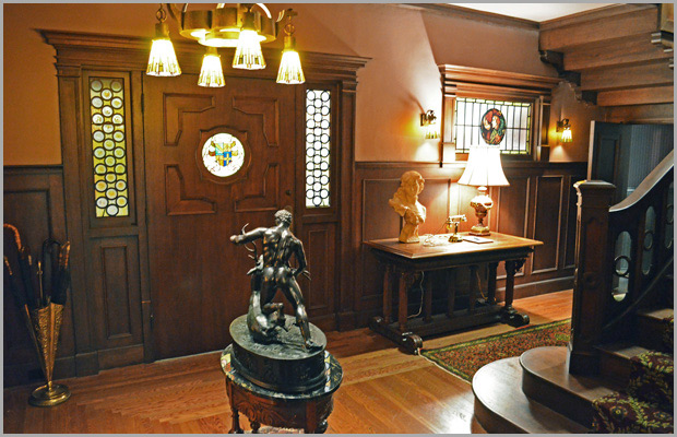
Here in Season 1: Murder House, Worthington marries stained glass windows with dark woods and illustrious sculptors. You feel the wealth of the family, but you soon see that the appearance of wealth does little to hide the love missing within these walls. Maneuvering through the house throughout the season, we see that each room has a different feel and features elements from different time periods. For example, Violet (Taissa Farmiga) resides in a typical teenager’s room with contrasting components of her parents’ ideas versus teenage interest. Likewise, the kitchen pairs ornate hardwood cabinets against modern, stainless steel appliances.
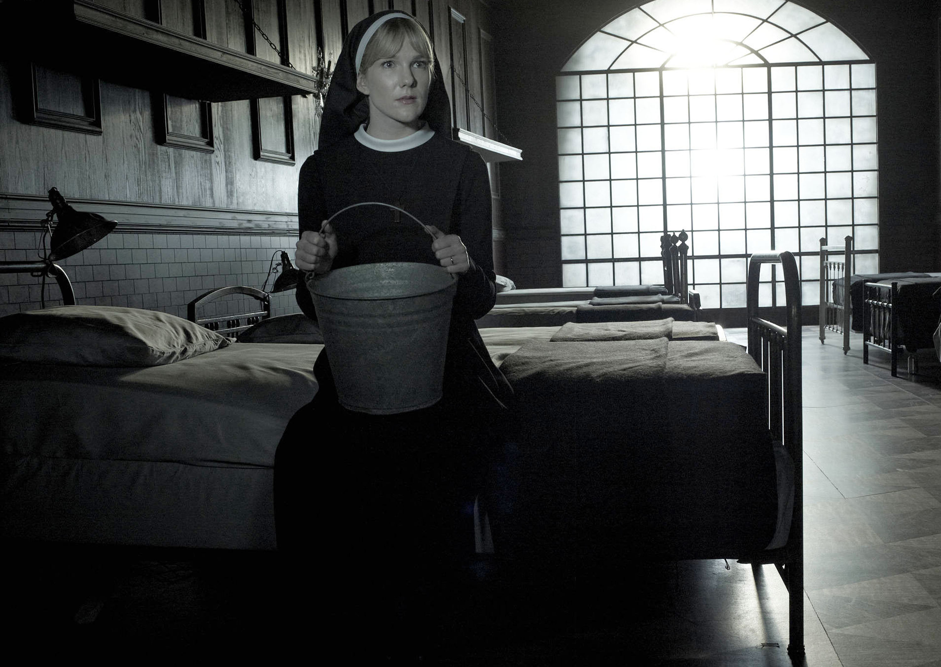
In Season 2: Asylum, Worthington took a minimalist approach. Many barren walls and lack of ornate fixtures allowed us to sense that the characters were withdrawn from the much larger world. It was easy to see how the principles of sympathy changed when characters’ encounters were limited.
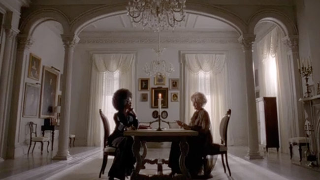
Season 3: Coven offered different designs depending on the senior witch it followed. Yet, nothing stood out more than the Coven House, boasting high ceilings over an almost minimalist tone of gothic royalty.
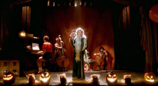
In Season 4: Freak Show, Worthington brought a carnival to life. He gifted us with the extravagance we experience whenever we attend these entertaining locations, but he also exposed a dark environment behind the scenes. Rich reds and oranges spilled often, teasing one moment and tormenting the next.
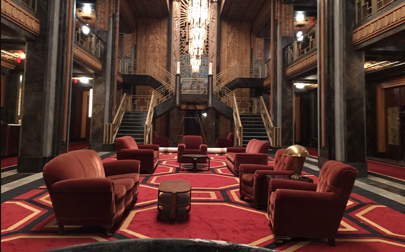
Worthington brought the gold accents heavily in Season 5: Hotel. The lobby proposed luxury to people with mountains of money and secrets. There were a few surprises in design this season, one being the all-white room with televisions stretching from floor to ceiling.
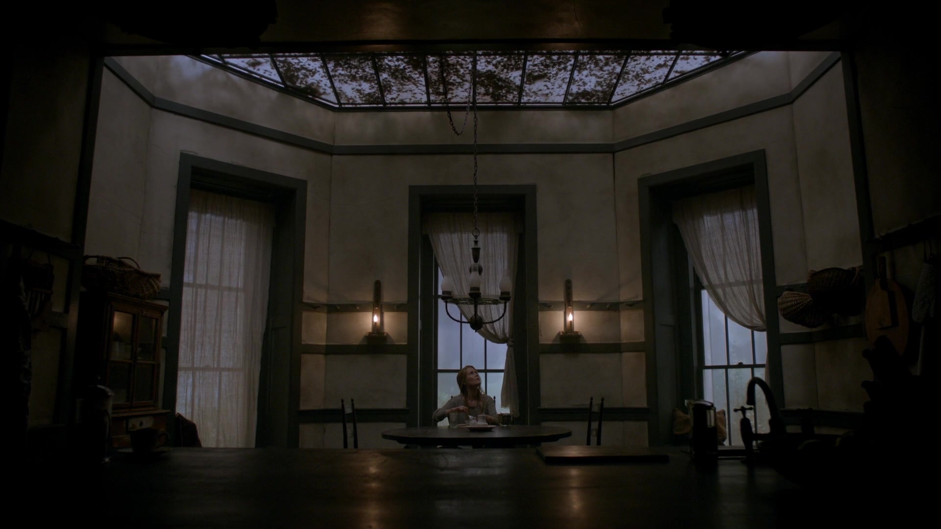
Andrew Murdock mixed an overwhelming sense of colonialism aged with generations and cultures of change in Season 6: Roanoke. The house welcomed newcomers with charm and the pleasure of personalizing it as your own. However, nearby locations hidden in the surrounding woods offered only grime and decay.
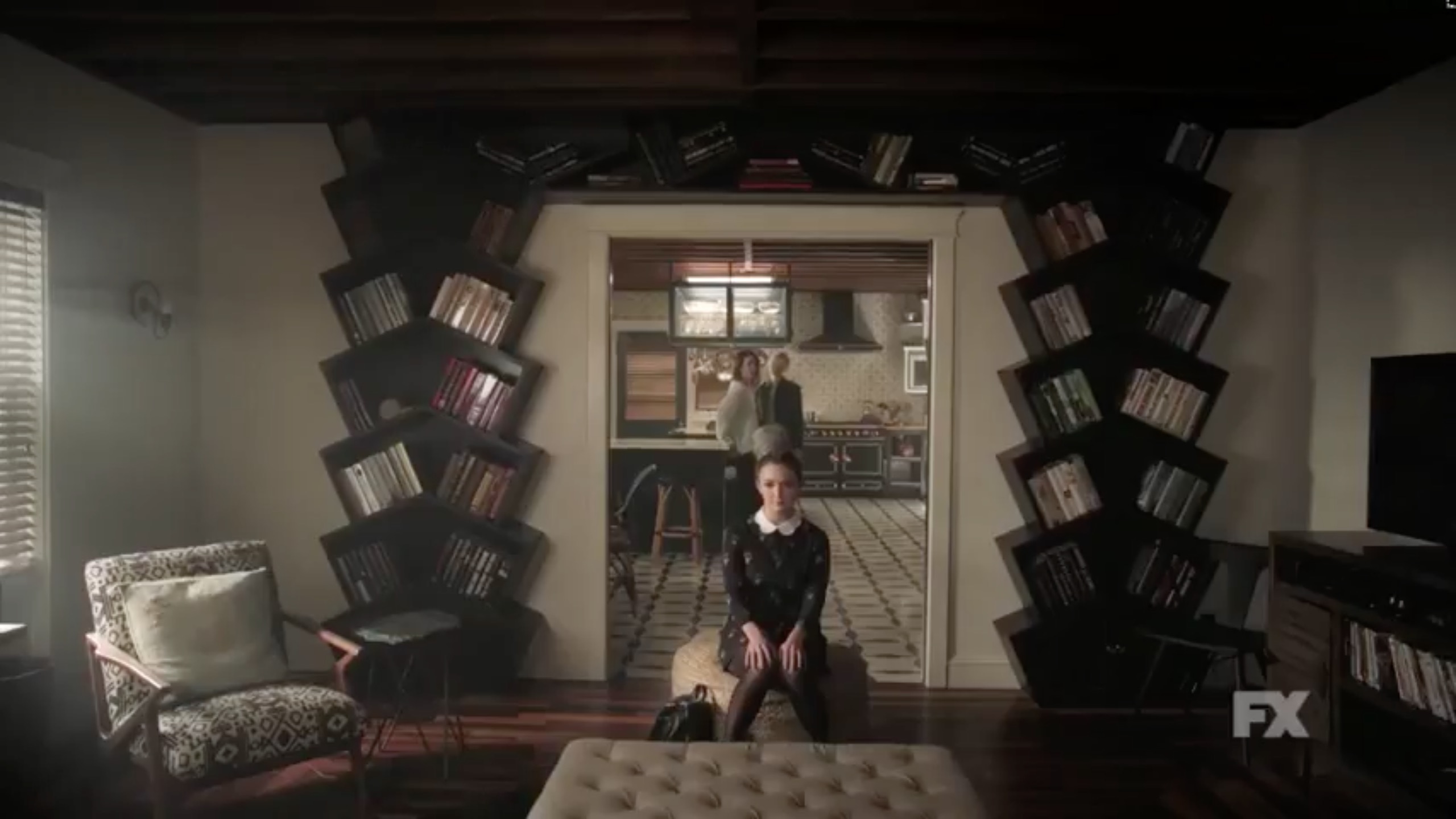
Jeffrey Mosa put his unique stamp on Season 7: Cult. This season mixed contemporary design with the past and future. In one room, you observed geometric bookcases framing a threshold; in another, you behold an artist’s assault with black paint against a white canvas. Almost every room held a memorable piece.
Giles Masters begins Season 8: Apocalypse. He has some tough acts to follow, but with his resume as an art director of First Knight, The Mummy, Van Helsing and The Davinci Code, I am confident that he will bring something unique to the table.
Did you check out American Horror Story: Apocalypse this past Wednesday, 9/12 on FX?
Interested in chatting horror with me?

Post a Comment